AI writes the report. Nobody reads it.
Your AI generates brilliant 47-page analyses. Your exec reads the summary. The summary misses the nuance.
PowerPoint forces you to over-summarize. After slide 4, the room is gone.
Dashboards are for analysts, not decisions. They show data. They don't create understanding.
Flow is the missing layer between AI and human comprehension.
How It Works
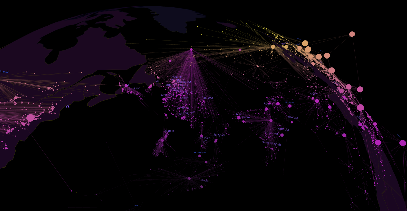
Ask a question
Voice or text, natural language. "Show me our portfolio exposure by sector and region." 60 seconds later, you're walking through it.
Explore together
Your team sees the same spatial narrative. Smart glasses, laptops, phones — everyone in the same room of data.
Decide with confidence
Spatial memory means the insight sticks. A week later, your team remembers what they saw and what they decided.
See It in Action
Data on Smart Glasses
Collaborative Meeting with AI
SCP Overview
Who Uses Flow
Trusted by
United Nations · World Bank · KPMG · PwC · Deloitte
Get Early Access
Join the waitlist for the Spatial Cognitive Platform.